




contact us
phones
13/02/2026
Color psychology and its importance in architecture
All we can see are the colors not only of subjects around us but also the walls, the furniture and the walls. However, our brain doesn’t “see” them, it “translates” them in many ways which can influence the way we feel, heal or perform. That is how important choosing the right color in architecture is.
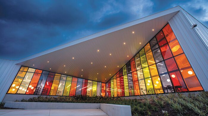
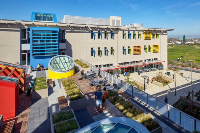
Let’s see which color is suitable for different kind of building and why that is so important. For example, some schools use the color of the architecture as a learning partner.
This advice of coloring the right way adopted Nueva School in California, USA. They paint their math and science rooms in red dominated patterns that help students to concentrate easily. While the art corners are in blue or green which encourages the creative flow of mind. That leads to improvement of 15% in creative thinking.
Libraries on other hand should be in blue or green shades because they should calm the visitors. The facade of the building is not dull as we expect to see more often.
The workplace need to absorb the color psychology in their architecture. It was never a good idea to “lock” your workers in grey cubicles, but we know how spread it is. According to a research it reduces the performance. Green and blue shades can help as it was mentioned above in the school buildings.
When the work needs collaborations, the colors of the environment should be warmer. For example, the meeting room for creative teams can be orange and yellow, even warm red but never the aggressive red.
Nowadays, many architects take in mind color psychology for their new project. That way we can see many creative designs which enhance not only the place but also the people who work, live or use them.
